Brand Assets
Official logos, color palette, and typography guidelines for Trackdrive.
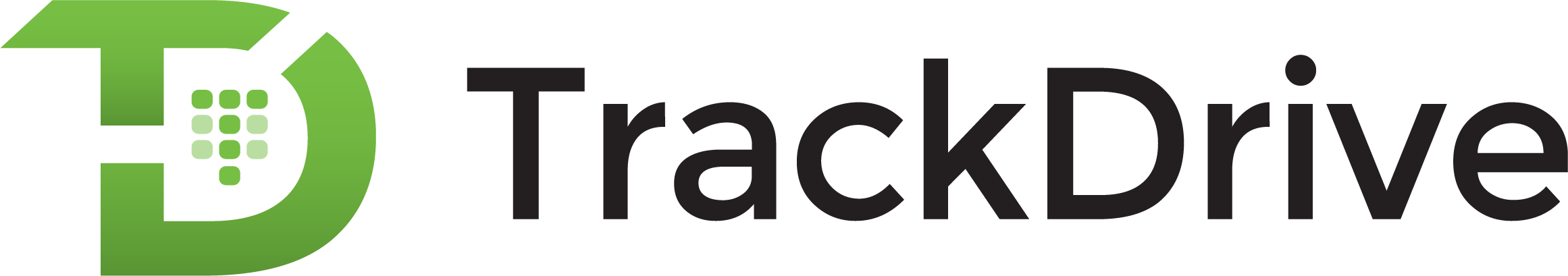
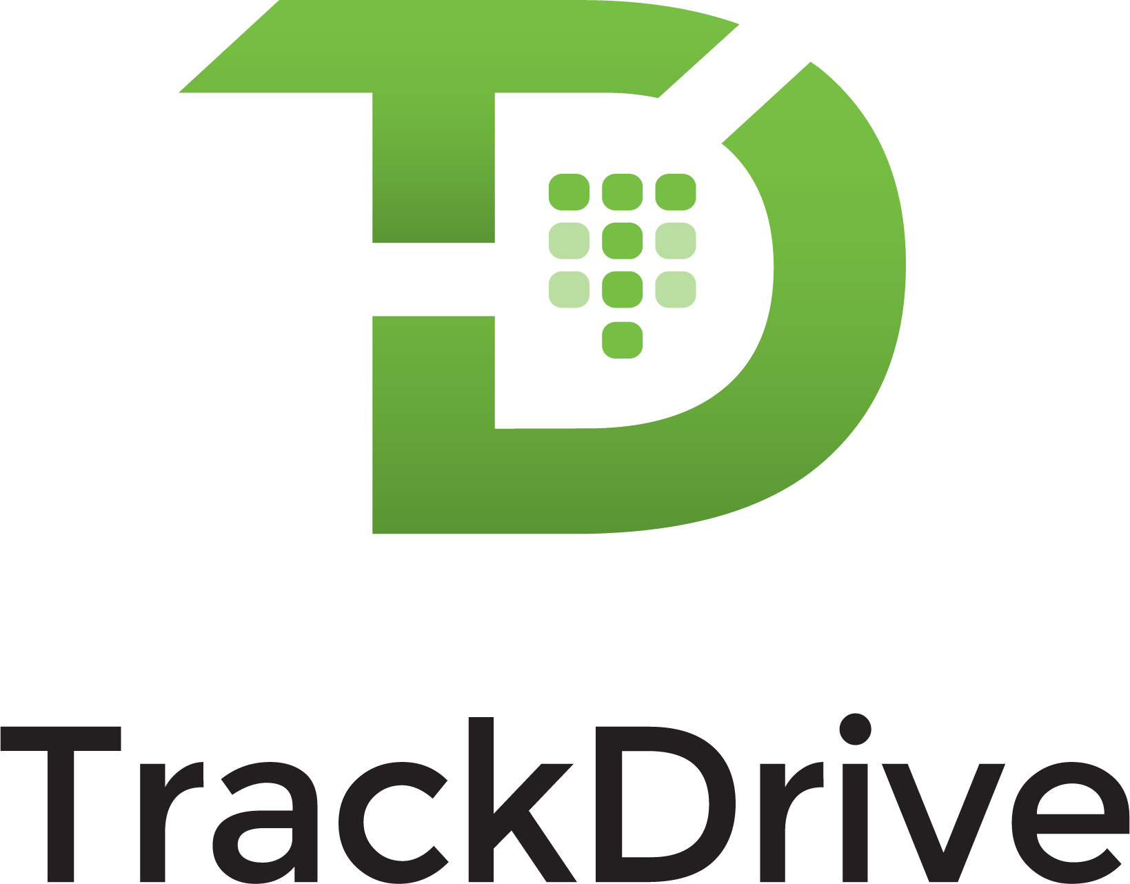
Logo Guidelines
The logo should never be placed vertically, outlined or modified in shape or form.
Color Palette
Start with a white canvas, accompanied by a dominance of Trackdrive green. Filled with cool grey copy and splashed accents of CTA orange.
Download Color Palette (.ASE)Typography
Our primary typeface is used for headlines. The supporting typeface handles paragraphs, annotations, navigation elements and buttons.
Headline 1 is Rubik Medium at 64px.
Headline 2 is Rubik Medium at 48px.
Headline 3 is Rubik Medium at 36px.
Headline 4 is Rubik Regular at 24px.
Headline 5 is Rubik Regular at 20px.
Headline 6 is Rubik Regular at 14px.
Paragraphs are in Work Sans Regular at 18px.
Buttons & navigation elements use all caps in Work Sans Regular.

Ready to get started?
See how the Voice Marketing Cloud can improve your marketing and the customer experience — or reach out and a specialist will get back to you.